hand.gemacht Identity
The visual identity of hand.gemacht translates the research concern into a visible form and makes it accessible to different audiences. The design decisions derive from the research subject itself. Imperfect lines reflect the handcrafted imprecision of the objects, and the shadow in the logo picks up the idea of an abstracted, functionally extensible image. The colour palette uses muted, natural tones with warm, broken background colours. The identity carries the entire communication for hand.gemacht across digital and print, and operates as a second medium of the research itself.
A research project unfolds its impact once its findings become recognisable. A distinct visual appearance is part of that recognisability. In hand.gemacht the design dimension belonged to the research strategy from the start. The guiding question was how this appearance carries the research logic itself. From this question all further design decisions followed. Researchers benefit from such care, because it makes their work readable for both specialist audiences and a broader public.
The design concept derives from the working process of handmade objects. It connects craft tradition with digital method, grown form with mathematical precision. This connection carries every single design decision. The visual language shows it in rounded edges and slightly swaying contours that take up the small irregularities of manual work. In the logo the same mediation appears in the shadow beneath the wordmark. A simple stroke picks up the same logic that shapes the 3D scans in the research project, the idea of an image as a working abstraction. In print and digital applications alike, the shadow takes on additional tasks, for instance as a way-finder or as a carrier of further information. The colour palette picks up the same doubling. Warm base tones and a triad of Himmelblau, Terracotta and Entengelb stay lively and close to nature. With its serifs Roboto Slab connects to antiqua traditions, while its constructed letter forms carry the modern character.
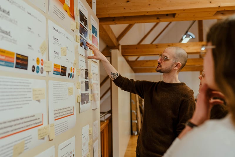
The design decisions are recorded in visual guidelines. These provide a framework for everyone working on the project, one that secures recognition while leaving room for variation. The guidelines describe principles by which new situations can be designed. This openness matters in a research context. Changes in the project team and varying media accompany the lifespan of a research undertaking. Digital applications range from the website and Unikathek to presentation slides. In print, the visual appearance shows up in posters, publications and accompanying material.
In its visual appearance the project gains a voice of its own. Specialist audiences, partner institutions, funders and a broader public encounter a consistent form that makes the research subject accessible to different readings. The design work thus becomes part of the research itself. It demonstrates how design can carry the tensions of a project and translate them into a recognisable form. The approach is transferable to other research undertakings in which similar polarities between tradition and technology come into play.